DATA VISUALIZATION To communicate information clearly and efficiently, data visualization uses statistical graphics, plots, information graphics and other tools. Effective visualization helps users analyze and reason about data and evidence. It makes complex data more accessible, understandable and usable. Users may have particular analytical tasks, such as making comparisons or understanding causality, and the design principle of the graphic (i.e., showing comparisons or showing causality) follows the task. Tables are generally used where users will look up a specific measurement, while charts of various types are used to show patterns or relationships in the data for one or more variables. Measures, metrics, and KPIs (Key Performance Indicators) – are all about data. We currently have access to more data than ever before. The amount of data we produce every day is truly mind-boggling. There are 2.5 quintillion bytes of data created each day at our current pace (2019), but that pace is only accelerating with the growth of the Internet of Things (IoT). It’s growing at such a rapid pace that 90 percent of the data in the world was generated between 2016 and 2018. While it’s almost impossible to wrap your mind around these numbers, understanding and making productive use of it is essential to our clients’ business. The benefit lies in our ability to display data so that you know exactly what’s going on in your business - at all times. The solution is found in the development and use of custom dashboards -a tool that cuts through data clutter and helps you get down to what really matters. Dashboards are a visual representation of your business’ data that is essential to achieve your goals. This data is consolidated and showcased on a single screen so that it can be tracked and monitored at a glance. Truly helpful is the fact that the data is automatically updating itself without any assistance from the user. With the right dashboard, you can experience the satisfaction of leading your business to success. Our network of Data Visualization specialists will work with you to develop the dashboard that best meets your needs. |
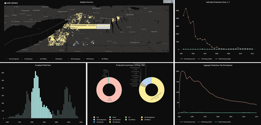
DASHBOARDS Data dashboards provide a centralized, interactive means of monitoring, measuring, analyzing, and extracting a wealth of business insights from relevant datasets in several key areas while displaying aggregated information in a way that is both intuitive and visual. They offer users a comprehensive overview of their company’s various internal departments, goals, initiatives, processes, or projects. These are measured through Key Performance Indicators (KPIs), which provide insights that help to foster growth and improvement. Without the existence of dashboards and dashboard reporting practices, businesses would need to sift through colossal stacks of unstructured data, which is both inefficient and time-consuming. Alternatively, a business would have to ‘shoot in the dark’ concerning its most critical processes, projects, and internal insights, which is far from ideal in today’s world. |
|
STRATEGIC DASHBOARDS
Our strategic dashboards give clients a top-level, horizontal overview of how their companies and the departments responsible for the core activities perform. These dashboards contain all those KPIs that CEOs, CFOs, and other top management members have named vital in their decision-making processes in the dashboard projects that we have conducted at large enterprises with revenues ranging from 400 million to 4 billion. |
|
TACTICAL DASHBOARDS
Our tactical dashboards contain high to mid-level aggregations of data and present a vertical overview of the performance of a given department. This view of a given data silo provides a high-level overview and allows drill-downs to lower levels of data aggregation too, enabling the people directly responsible for the department to have a full picture of its operations. |
|
OPERATIONAL DASHBOARDS
Our operational dashboards provide a mid- and low-level of data aggregation. This view of a data present at a given department, a smaller subdivision, or a project, provides an interface, which allows end-users to access and examine data at their lowest level of aggregation. |
